User Unfriendly Notes Towards a Queer Web
User Unfriendly Notes Towards a Queer Web
Agile Denver — March 18, 2019
OddBird siblings (Jonny, Carl, and Miriam) in 1994
OddBird Clients: Mozilla, SRAM, ORCAS
Susy
No Susy
Dark Raspberry
anywhere between maroon and magenta…
User Experience > Software Design
Teacup Gorilla at Larimer Lounge
Riding SideSaddle* | a novel
Shuffling the sidesaddle cards
2016 True West Award in Theater
Theater > One Medium
writing, acting, choreography, architecture, music, lights…
Web > One Medium
writing, architecture, code, design, interaction…
Screenshot of first world wide website
CERN first website, with line-mode browser simulation
Web for all. Web on everything.
—World Wide Web Consortium, 1989
Old IBM desktop
Desktops
All iPhones
Several tablets
100s of mobile Devices
Lineup of smart watches
The Web is User-Centered by Design
! 👨
Masculine emojis
Feminine emojis
Various people emojis
The fact we can control a paper page is really a limitation of that medium.
—John Allsopp, A Dao of Web Design (April 07, 2000)
What’s the Print Vision?
What are the Tradeoffs?
Novel in a box
Novel online, with interactive controls
read.ridingsidesaddle.com (in progress)
The ‘collectible’ is because sometimes you want to treasure the book and touch the book and know that you have a special one.
—Seth Godin, Transforming the Book Industry
Performative Turn
One text becomes a novel, a web app, an album, and a theater production…
screenshot of web page markdown, templates, and output html
screenshot of web page markup
screenshot of web page without CSS
screenshot of web page with CSS
miriamsuzanne.com (now with a whole new look)
Looks pretty cool, but having the menu and the text rotated like that just makes them super difficult to read…
—Dude, Online
¯\_(ツ)_/¯
What is User Friendly?
Users spend most of their time on other sites. This means that users prefer your website to work the same way as all the other sites they already know.
All iPhones
“Intuitive” or “Invisible”?
chart of common touch gestures
“Open” or “Adaptable”?
Raspberry Pi Kit vs Tablet
It Always Depends
A Queer Theory Primer
[the oversimplified version]
“Strange” or “Peculiar”
1800’s: becomes a (sexual) insult
1980’s/90’s: Reclaimed
A big tent movement
“We’re all the same”
We’re All Different
…but our struggles & identities intersect…
“We’re normal too”
“Normal” is Suspect
Who Defines it? Who Benefits?
“Normal” points to a power-imbalance…
All iPhones
Do We Enforce Sameness?
No!
Under an increasing pressure to monetize the data they store, Facebook looks for ways to limit difference across the site.
—Ben Grosser, How the Technological Design of Facebook Homogenizes Identity and Limits Personal Representation
Do I want to create work in which everyone feels the same, or everyone feels differently?
—Anne Bogart, A Director Prepares
Bootstrapping vs Plug-and-play
Bootstrapping:
Augmenting Human Intellect
Providing the means for users to create better tools.
Layers of Abstraction
Susy
No Susy
Douglas Engelbart demos modern computing
Douglas Engelbart, The Mother of All Demos (1968) | the mouse, hypertext, view switching, networked computers, early GUI
You cannot create results. You can only create conditions in which something might happen.”
—Ann Bogart, A Director Prepares
Plug-and-play:
It Just Works
Iconic Seve Jobs photo
Steve Jobs, Apple II (1993)
Identical, Easy-to-Use, Low-Cost Appliance
What Are the Tradeoffs?
Know Your Innovation Budget
Know Your Goals
click-through rates are not universal success
Start with Users
Every User is an Expert
They know more about their needs than you do.
“If I had asked people what they wanted, they would have said faster horses.”
—
Henry FordJohn McNeece (kinda)
User Expertise:
- End Goals
- Existing Solutions
- Points of Failure
User Blind Spots:
- Interface Design
Ask about Problems, not Solutions
works with art feedback as well…
When the Problem is in Act V, The Solution is Often in Act I
Always Ask Why
look for the root causes…
Analyze Patterns
common pain-points, related issues, etc…
Recognize Personal Bias
Dark Raspberry
Empathy is Awesome
but…
Also Need Diversity & Inclusion
More perspectives, with the power to make change
Various people emojis
Communicate with Clients
Present Context & Tradeoffs
establish yourself as a teammate…
Only Show Good Options
Mind games always backfire
Ugly Helps
Use sketches & wireframes to focus on what’s important
UX sketch
UX wireframes with colors/fonts removed
Less Theory, More Practice
put options in front of users
Fewer Mockups, More Prototypes
Clickable wireframes
Experiment Often
hypothesis » test » adjust
“Experimental” is a Process
Not a reason to make your friends sit through shitty performance art
Riding Sidesaddle*
Tight Feedback Loop
Test, Test, Test
Look at Different Angles
Elements of Design
- Color
- Form
- Line
- Shape
- Space
- Texture
- Value
Viewpoints of Theater
- Spatial Relationship
- Kinesthetic Response
- Shape
- Gesture
- Repetition
- Architecture
- Tempo
- Duration
- Topography
Aspects of the Web?
- Size
- Browser
- Operating System
- Language
- Access Type (visual, audio, etc…)
- Interaction Type (mouse, touch, etc…)
- … ?
Question Your Assumptions
Use All The Tools
Unison, Harmony, & Dissonance
Know Where You Are
- Define the Seed: What’s the idea, question, or hypothesis?
- Explore: Research, gather, and create the materials…
- Organize: Outline the structure, or impose one…
- Draft: Make something that flows…
- Revise: Consider, critique, and edit as needed…
Encourage Playfulness
“Spark & Slip”
Remix Everything

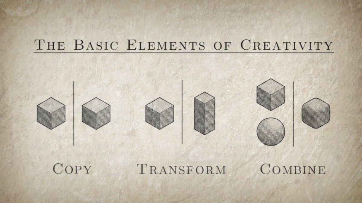
Creativity isn’t magic. It happens by applying ordinary tools of thought to existing materials.
—Kirby Ferguson, Everything is a Remix
[Agile] Cycles
We need to be in the open mode when we’re pondering a problem, but once we come up with a solution, we must then switch to the closed mode to implement it.
—John Cleese
