Dynamic CSS Layouts & Beyond
Dynamic CSS Layouts & Beyond
Develop Denver — August 15, 2019

Three children at a table – playing Magic, The Gathering
OddBird siblings (Jonny, Carl, and Miriam) in 1994
Susy
Susy, scribbled out
1989: HTML
Markup Language
It is required that HTML be a common language between all platforms. This implies no device-specific markup, or anything which requires control over fonts or colors.
—Sir Tim
Screenshot of first world wide website
CERN first website, with line-mode browser simulation
1996 2000: Cascading Style Sheets
 (The End)
A zillion different devices of all sizes (original)
Lineup of smart watches
Braille computer attachment and headphones
Declarative Syntax
!=
Static Results
Design for an Unknown Canvas
CSS is Dynamic & Resilient by Design
2011: calc()
Firefox 4 – function
calc( 16px + 20% )
Combine Relative & Fixed Widths!
2014: CSS Variables
Firefox 31 (unless you count currentColor)
--aka: 'custom properties';
-<empty>-browser-prefix
var( --property-name , fallback)
[Custom Props (live code) by @mirisuzanne | presentation]
[Variables » Functions » Mixins (live code) by @mirisuzanne | presentation]
CSS Custom Properties in the Cascade by Miriam Suzanne
Article on Smashing Magazine
[SusyCSS by @mirisuzanne | presentation]
[SusyCSS Demo by @mirisuzanne | presentation]
Susy, scribbled out
Please Don’t Use It
Manipulate hsl() Values
* {
  --h: 330;
  --s: 100%;
  --l: 34%;
  background: hsl(var(--h), var(--s), var(--l));
}
Hue is Radial
* {
  --complement: calc(var(--h) - 180);
  background: hsl(var(--complement), var(--s), var(--l));
}
Lightness is “Clamped”
* {
  --threshold: 55;
  --contrast: calc((var(--l) - var(--threshold)) * -100%);
  color: hsl(var(--h), var(--s), var(--contrast));
}
Complement
Inspired by Facundo Corradini [permalink / source]
html {
  --os-mode: 1;

  @media (prefers-color-scheme: dark) {
    --os-mode: -1;
  }

  @media (prefers-color-scheme: light) {
    --os-mode: 1;
  }
}
[data-colors='light'] {
  --html-mode: 1;
}

[data-colors='dark'] {
  --html-mode: -1;
}

[data-colors] {
  --given-mode: var(--user-mode, var(--html-mode, var(--os-mode, 1)));
  --mode: var(--given-mode, 1);
}
2017: CSS Grid
Firefox 52 & Chrome 57 & Safari 10
Lines & Spans
.container {
  display: grid;
  grid-template-columns: repeat(12, 1fr);
}

.example {
  grid-column: 1 / 4;
  grid-row: 2 / span 2;
}
Named Areas
body {
  grid-template-areas: 'header header'
                       'nav main'
                       'nav footer';
}

h1 { grid-area: header; }
nav { grid-area: nav; }
main { grid-area: main; }
footer { grid-area: footer; }
Single Source of Truth
@media (max-width: 50em) {
  body {
    grid-template: 'header'
                   'nav'
                   'main'
                   'footer';
  }
}
2018: Intrinsic Web Design
- Fluid & Fixed
- Stages of Squishiness
- Truly Two-Dimensional Layouts
- Nested Contexts
- Expand & Contract Content
- Media Queries, As Needed
px/em/% => fixed
fr => fluid
minmax() => fluid until fixed
auto => flow
% => relative to parent width
vw => relative to the viewport
fr => relative to available space
1fr == minmax(auto, 1fr)
use minmax(0, 1fr) to allow shrinking
Client Day Planner
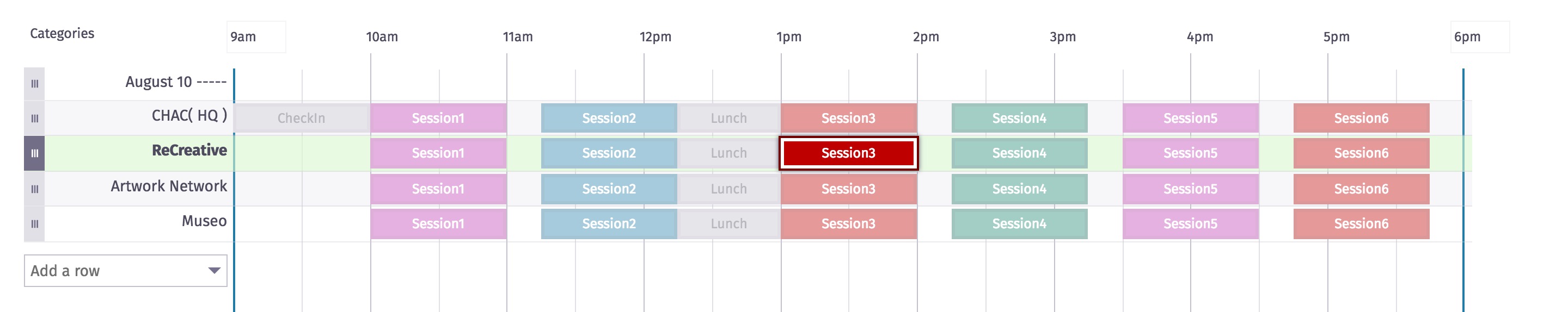
Define the Day
<main style="
  --day-start: 9,
  --day-end: 18
">
Define the Events
<section style="
  --event-start: 13,
  --event-end: 14
">
| 2000 | |
|---|---|
| 2001 | |
| 2002 | |
| 2003 | |
| 2004 | |
| 2005 | |
| 2006 | |
| 2007 | |
| 2008 | |
| 2009 |
Dynamic CSS
Styles Generated Dynamically from Content
One does not simply “learn” JavaScript
Levitated Toy Factory at Beyond Tellerand
| name | x value | y value | size == z value |
|---|---|---|---|
| item-0 | 14 | 25 | 19 |
| item-1 | 50 | 57 | 6 |
| item-2 | 49 | 21 | 8 |
| item-3 | 50 | 73 | 12 |
| item-4 | 79 | 56 | 11 |
| item-5 | 77 | 39 | 23 |
| item-6 | 77 | 51 | 14 |
| item-7 | 97 | 70 | 4 |
| item-8 | 43 | 77 | 17 |
| item-9 | 93 | 98 | 5 |
| item-10 | 18 | 9 | 20 |
| item-11 | 24 | 15 | 20 |
| item-12 | 29 | 49 | 20 |
| item-13 | 28 | 51 | 6 |
| item-14 | 3 | 34 | 1 |
| item-15 | 48 | 95 | 14 |
| item-16 | 64 | 94 | 6 |
| item-17 | 64 | 35 | 1 |
| item-18 | 54 | 71 | 2 |
| item-19 | 43 | 44 | 5 |
| index | value |
|---|---|
| 0 | 28 |
| 1 | 94 |
| 2 | 59 |
| 3 | 51 |
| 4 | 57 |
| 5 | 69 |
| 6 | 96 |
| 7 | 56 |
| 8 | 37 |
| 9 | 23 |
| 10 | 45 |
| 11 | 81 |
| 12 | 51 |
| 13 | 4 |
| 14 | 2 |
Krystal Campioni sprite animation
Sprite from Monster Slayer animation
Animated sprites from Monster Slayer by Krystal Campioni [permalink / source]
Inspired by Stacy Kvernmo [permalink / source]