Agile Design Systems
Agile Design Systems
Agile Denver — October 22, 2018
2016 True West Award in Theater
Devised Theater == Agile Process
OddBird siblings (Jonny, Carl, and Miriam) in 1994
ORCAS CoachHub
US Military, Coast Guard, and NIH
Client: ORCAS, Field: Health Care
Quarq Race Intelligence
Ironman Championships
Client: SRAM, Field: Professional Athletics
Project Manager
UX Designer & Front End Architect
Contract Work
Launch + Handoff
On A Budget & Timeline
Integrated & Agile Process
Design Systems!
Intersection of Design & Code & Documentation
Salesforce Lightning Design System
Lonely Planet Design System
Mailchimp Grids
Herman Scale Previews
M
New York City Transit Authority Graphic Standards Manual
1970
N
Numbers 5-8
Diagram of sign construction
« Nerd
Nerd »
¯\_(ツ)_/¯
Nerd
Design Systems
Style Guides + Toolkits + Pattern Libraries + ???
Mailchimp Voice
Salesforce LDS Motion System
Lego Component Library
Lego Organizer
Lego Airplane
Design Systems == Integration
Design & Code & process & tools & … & ???
LDS icons with markup
Scribbled out: LDS icons with markup
You are not MailForce or InstaFace
(unless you are)
Similar Problems
Unique Constraints
(Team Size)
(Team Structure)
(Internal vs. Consulting)
(Is it 1970?)

“If it doesn’t have tests, it’s legacy code”
Patterns must be repeatable
“If it’s not documented, it doesn’t exist”
Patterns must be repeated
Since OddBird thinks about handoff from the beginning, maintenance has been super easy. For example, 100% unit test coverage was a given. I never had to ask for it.
—Sara Taillon, CTO at ORCAS
Why Design Systems?-
Pattern Audit
- Start with Design Tokens
- Integrated Agile Process
- Define the API
Existing Apps:
What Do We Have?
Take Screenshots
Organize into Groups
Image by Brad Frost
All Apps:
What Do We Need?
Why Design Systems?Pattern Audit-
Start with Design Tokens
- Integrated Agile Process
- Define the API
3. Start with Design Tokens
3. Start Somewhere, Stay Agile
Normal Triangle by Maslow Miriam
Cascading Style Sheets
Invented to create re-usable patterns
.warning { color: red; }
Design Tokens (Settings)
CSS Custom Properties
:root {
  --color-text-default: rgb(62, 62, 60);
  --color-text-warning: rgb(255, 183, 93);
  --color-text-error: rgb(194, 57, 52);
}

.example {
  background: var(--color-text-error);
}
👍 Browser Support
👎 Not Meaningfully Organized
👎 Encourages One-Offs
👎 Difficult to Automate
Sass Variables
$color-text-default: rgb(62, 62, 60);
$color-text-warning: rgb(255, 183, 93);
$color-text-error: rgb(194, 57, 52);

.example {
  background: $color-text-error;
}
👎 Not Meaningfully Organized
👎 Encourages One-Offs
👎 Difficult to Automate
Sass Maps
$text-colors: (
  'default': rgb(62, 62, 60),
  'warning': rgb(255, 183, 93),
  'error': rgb(194, 57, 52),
);

.example {
  background: color('error');
}
The Map Problem
$colors: (
  'brand-blue': hsl(195, 85%, 35%),
  'gray': desaturate(map-get($colors, 'brand-blue'), 80%),
);
[ERROR] Undefined variable: "$colors".
Map Self-Reference
$colors: (
  '_brand-pink': hsl(330, 85%, 68%),
  'escher': '#_brand-pink',
  'godel': '#escher',
  'bach': '#godel',
  'kevin bacon': '#bach' ('lighten': 20%),
);
color('kevin bacon')
👍 Meaningful Relationships!
👍 Encourages Patterns
👍 Functional Adjustments
👎 Requires Additional Tooling
Even More Layers
Global Settings » Theme Defaults » Component Details
$brand-colors: (
  '_brand-blue': hsl(195, 85%, 35%),
  '_brand-pink': hsl(330, 85%, 48%),
);

$theme-colors: (
  'text': …,
  'border': …,
  // ...
);

$button-colors: (
  'button-text': …,
  'button-border': …,
  // ...
);
“Code is Communication”
—Sarah Drasner
.grid-span {
  width: 23.7288136%;
  margin-right: 01.6949153%;
  padding-left: 08.4745763%;
}
.grid-span {
  width: ((3*4em) + (2*1em)) / ((12*4em) + (11*1em)) * 100%; // 23.7288136%
  margin-right: 1em / ((12*4em) + (11*1em)) * 100%; // 01.6949153%
  padding-left: ((1*4em) + (1*1em)) / ((12*4em) + (11*1em)); // 08.4745763%
}
Code Patterns Add Meaning
.grid-span {
  width: span(3);
  margin-right: gutter();
  padding-left: span(1 wide);
}
// Susy Span
// ---------
/// This is the primary function in Susy —
/// used to return the width of a span across one or more columns,
/// and any relevant gutters along the way.
/// With the default settings,
/// `span(3)` will return the width of 3 columns,
/// and the 2 intermediate gutters.
/// This can be used to set the `width` property of grid elements,
/// or `margin` and `padding`
/// to push, pull, and pad your elements.
/// @example scss - span half the grid
///   .foo {
///     width: susy-span(6 of 12);
///   }
@function susy-span(…) {…}
YAML & Theo
props:
  text_default:
    value: "rgb(62, 62, 60)"
  text_warning:
    value: "rgb(255, 183, 93)"
  text_error:
    value: "rgb(194, 57, 52)"

global:
  type: "color"
  category: "brand-colors"
aliases:
  vermilion:
    value: "7, 83%"
props:
  color_vermilion:
    value: "hsla({!vermilion}, 53%, 1)"
  color_vermilion_dark:
    value: "hsla({!vermilion}, 43%, 1)"
👍 Easier to Export from YAML
👎 Not A Style Language
Know The Trade-Offs
adjust to your needs…
Why Design Systems?Pattern AuditStart with Design Tokens-
Integrated Agile Process
- Define the API
“Less Theory, More Practice”
Less Mockups, More Code
QuarqNet list sketch
QuarqNet code sample
QuarqNet interactive mockup
(Ugly Helps Focus)
QuarqNet final
Iterate on Features/Epics
sketch » wire-frame » html markup » back-end » design
Test, Test, Test
Tight Feedback Loop
“Move Fast & Fix Things”
Everyone is responsible & collaborating
Make Patterns & Documentation
The Lazy Option
Automate from Structured Code
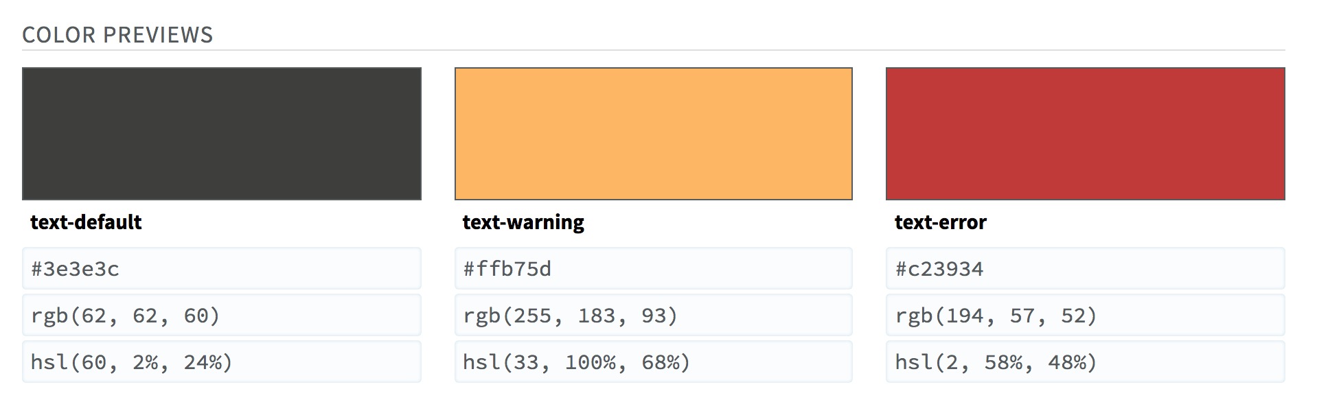
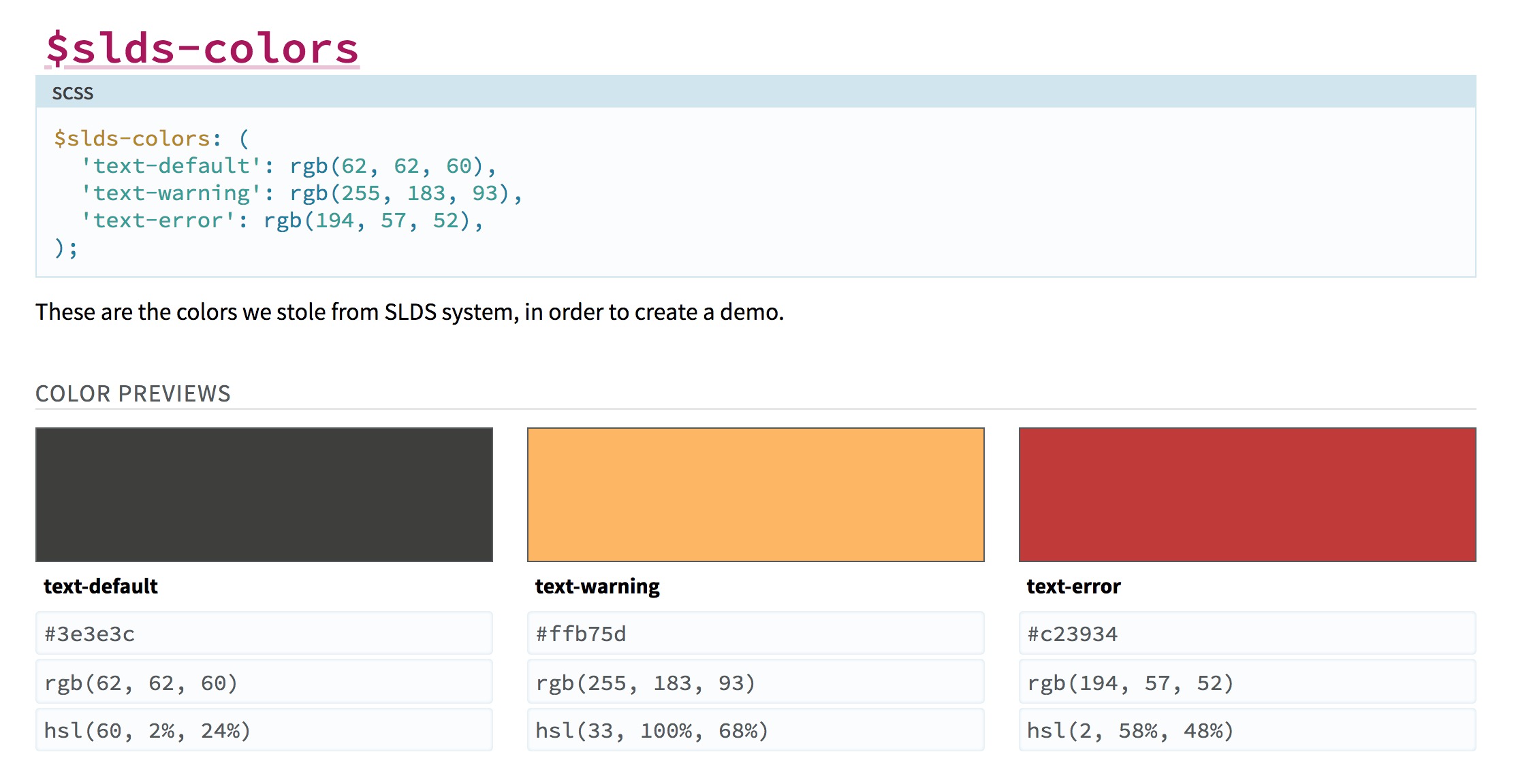
// SLDS Colors
// -----------
/// These are the colors we stole from SLDS system,
/// in order to create a demo.
/// @group color
/// @colors
$slds-colors: (
  'text-default': rgb(62, 62, 60),
  'text-warning': rgb(255, 183, 93),
  'text-error': rgb(194, 57, 52),
);
/// @colors
/// @sizes
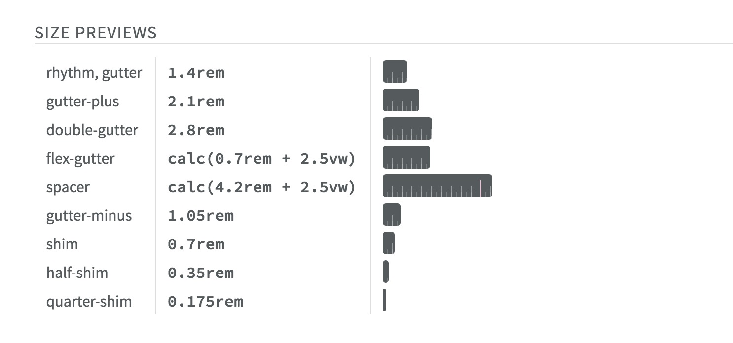
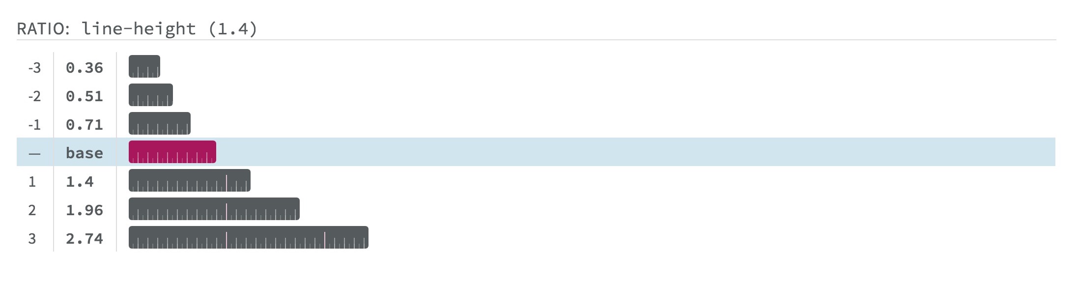
/// @sizes {ruler}
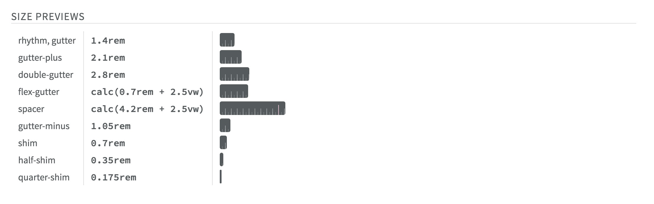
/// @ratios
Design System as Artifact
Code is a Single Source of Truth
Up-To-Date > Comprehensive
Start small, make it easy, and expand…
Why Design Systems?Pattern AuditStart with Design TokensIntegrated Agile Process-
Define the API
LDS icons with markup
class="slds-icon slds-icon-text-warning slds-icon--x-small"
Related Class Patterns » Data Attributes
icon color and size classes
data-slds-icon-color="<option>"
.slds-icon-text-default | .slds-icon-text-warning | .slds-icon-text-error
HTML Template Logic is Great
pre-processors for your markup!
Example: Vue
<icon :image="isSuccess ? 'checkmark' : 'x'">
Components Provide Meaning
<my-icon name="gear" />
/// @icons templates/icons/
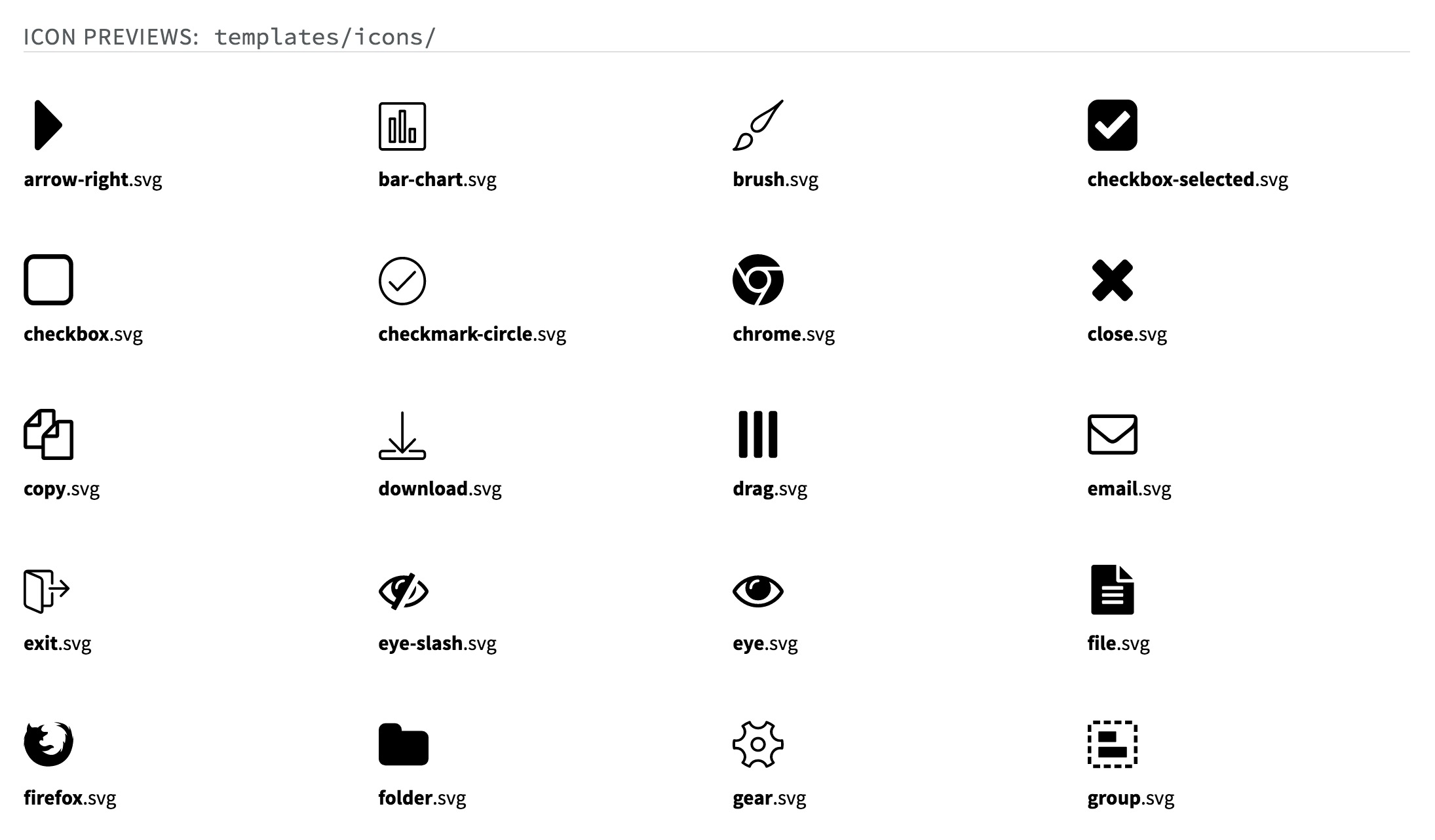
Consistency & Accessibility*
*If you bake that into the pattern…
Herman Components
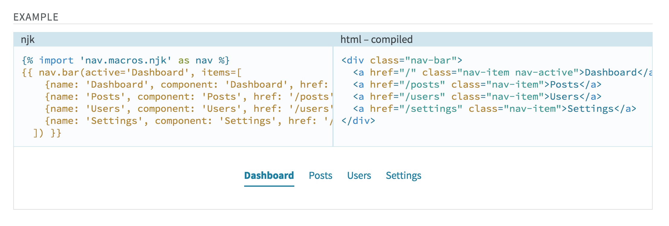
/// Navigation items, with inactive and active states.
/// @group nav
/// @example njk
///   {% import 'nav.macros.njk' as nav %}
///   {{ nav.bar(active="dashboard", items=[…]) }}
.nav-bar {
  /* … */
}
¯\_(ツ)_/¯
Sass-First Breaks Down…
Only Nunjucks For Now…
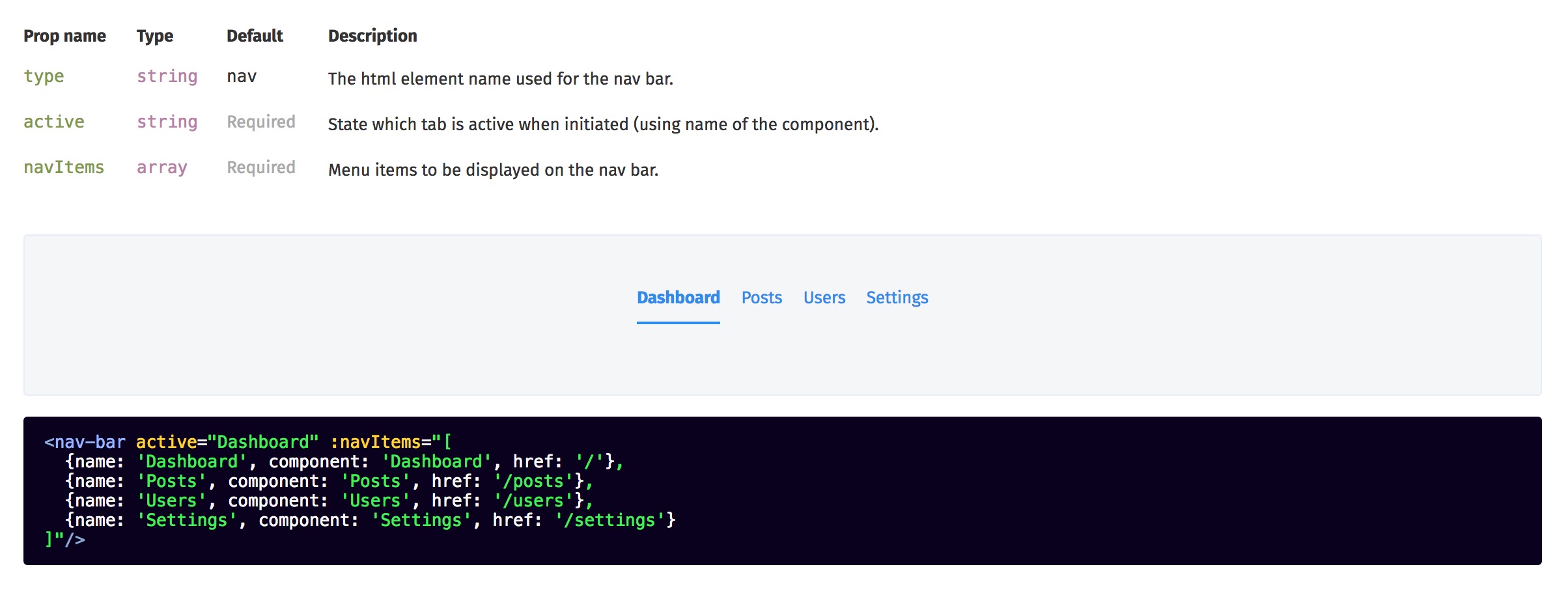
VueDS (with Theo)

VueDS Components
<docs>
  ```jsx
  <nav-bar active="Dashboard" :navItems="[…]"/>
  ```
</docs>
I Want Both :)
please…
Why Design Systems?Pattern AuditStart with Design TokensIntegrated Agile ProcessDefine the API
Meaningful & Structured Code
Readable by Humans & Machines
Inline Documentation
Helps the human factors…
Agile & Integrated Process
Everyone shares a single-source…