Agile Design Systems
🖨️ print/pdfAgile Design Systems
Agile Alliance — August 7, 2019
Three children at a table – playing Magic, The Gathering
OddBird siblings (Jonny, Carl, and Miriam) in 1994


Salesforce Lightning Design System
Lonely Planet Design System
Mailchimp Grids
Herman Scale Previews
M
New York City Transit Authority Graphic Standards Manual
1970
N
Numbers 5-8
Diagram of sign construction
Nerd
<-
Nerd
->
¯\_(ツ)_/¯
Design Systems
Style Guides + Tool Kits + Component Libraries + ???
Single Source of Truth
Potentially Cross-Application
even cross-platform…
Introduction to Bootstrap
Your Own Personal Bootstrap
Mailchimp Voice
Salesforce LDS Motion System
Lego Component Library
Lego Organizer
Lego Airplane
Girl from an 80s Lego commercial, holding her fantastic creation with a smirk
Baby eating a Lego block
Design Systems == Integration
Design & Code & Process & Tools & … & ???
LDS icons with markup
Scribbled out LDS icons with markup
You are not MailForce or InstaFace
(unless you are)
Similar Problems
Unique Constraints
(Team Size)
(Team Structure)
(Internal vs. Consulting)
(Web vs. OS-Specific)
(Is it 1970?)

Web Consulting
Designers + Developers + ???
How do you sell it to clients (or the boss)?
(We Don’t)
Since OddBird thinks about handoff from the beginning, maintenance has been super easy. For example, 100% unit test coverage was a given. I never had to ask for it.
—Sara Taillon, CTO at ORCAS
If it doesn’t have tests, it’s legacy code
—Carl Meyer
If it’s not documented, it doesn’t exist
—Me
If it’s not accessible, it doesn’t exist
—Also Me
Accessibility is a Basic Human Right
Perceivable, Operable, Understandable, Robust
Accessibility is For Everyone
long-term, temporary, situational, or robotic…
The Web is…
Accessible by Design
The Web…
Has a Mission
Web for all.
Web on everything.
—World Wide Web Consortium, 1994
Screenshot of first world wide website
CERN first website, with line-mode browser simulation
Old IBM desktop
Desktops
All iPhones
Several tablets
100s of mobile Devices
Lineup of smart watches
Braille computer attachment and headphones
The Web is…
Contextual by Design
The Web is…
Resilient by Design
The Web is…
Customizable by Design
The Web Model
Is User-Controlled By Design
HTML/CSS are Declarative
Too Many Variables
The fact we can control a paper page is really a limitation of that medium.
—John Allsopp, A Dao of Web Design (April 07, 2000)
Accessible == User Friendly
Use Built-In Tools
<button>
  Do a thing.
</button>
Fakes Are Not Robust
<div
  onclick="DoThing();"
  onkeypress="DoThing();"
  tabindex="0"
  role="button">
  Do a thing.
</div>
Provide Accessible Patterns
Document Accessible Uses
- Why Design Systems?
- Pattern Audit
- Start Small
- Define The API
- Integrated Agile Process
Existing Apps:
What Do We Have?
color stats from the VueConf website
font-size stats from the VueConf website
Take Screenshots
Organize into Groups
a wide variety of buttons from one web application
Image from Interface Inventory by Brad Frost
printed and cut-out UI elements grouped on a page
Image from From Pages to Patterns by Charlotte Jackson
All Apps:
What Do We Need?
- Why Design Systems?
- Pattern Audit
- Start Small
- Define The API
- Integrated Agile Process
Up-To-Date > Comprehensive
Start small, get it right, and expand…
Design Tokens
Abstract: broad reach, low specificity
Color Tokens
a triangle on it’s point, with ‘reach’ across the top and ‘specificity/explicitness’ down the sides
same triangle, flipped vertically
Normal Triangle by Maslow Miriam
stacked layers in the triangle labeled (from wide to narrow) – settings, tools, generic, elements, objects, components, overrides
Cascading Style Sheets
Invented to create re-usable patterns
.warning { color: red; }
Sass Variables
$color-text-default: rgb(62, 62, 60);
$color-text-warning: rgb(255, 183, 93);
$color-text-error: rgb(194, 57, 52);

.example {
  background: $color-text-error;
}
👎 Not Meaningfully Organized
👎 Encourages One-Offs
👎 Difficult to Automate
YAML & Theo
props:
  text_default:
    value: "rgb(62, 62, 60)"
  text_warning:
    value: "rgb(255, 183, 93)"
  text_error:
    value: "rgb(194, 57, 52)"

global:
  type: "color"
  category: "brand-colors"
aliases:
  vermilion:
    value: "7, 83%"
props:
  color_vermilion:
    value: "hsla({!vermilion}, 53%, 1)"
  color_vermilion_dark:
    value: "hsla({!vermilion}, 43%, 1)"
👍 Easier to Export from YAML
👎 Not A Style Language
Sass Maps
$text-colors: (
  'default': rgb(62, 62, 60),
  'warning': rgb(255, 183, 93),
  'error': rgb(194, 57, 52),
);

.example {
  background: color('error');
}
The Map Problem
$colors: (
  'brand-blue': hsl(195, 85%, 35%),
  'gray': desaturate(map-get($colors, 'brand-blue'), 80%),
);
[ERROR] Undefined variable: "$colors".
Map Self-Reference
$colors: (
  '_brand-pink': hsl(330, 85%, 68%),
  'escher': '#_brand-pink',
  'godel': '#escher',
  'bach': '#godel',
  'kevin bacon': '#bach' ('lighten': 20%),
);
color('kevin bacon')
Code is Communication
code {
  background: #d4e0e4;
  border: #92b1bc;
  color: #13323c;
}
code {
  background: mix($brand, #fff, 80%);
  border: mix($brand, #fff, 50%);
  color: mix($brand, #000, 50%);
}
Code Patterns Add Meaning
code {
  background: color('callout');
  border: color('border');
  color: contrast('callout');
}
👍 Meaningful Relationships!
👍 Encourages Patterns
👍 Functional Adjustments
👎 Requires Additional Tooling
Even More Layers
Global Settings » Theme Defaults » Component Details
$brand-colors: (
  '_brand-blue': hsl(195, 85%, 35%),
  '_brand-pink': hsl(330, 85%, 48%),
);

$theme-colors: (
  'text': …,
  'border': …,
  // ...
);

$button-colors: (
  'button-text': …,
  'button-border': …,
  // ...
);
CSS Custom Properties
:root {
  --color-text-default: rgb(62, 62, 60);
  --color-text-warning: rgb(255, 183, 93);
  --color-text-error: rgb(194, 57, 52);
}

.example {
  background: var(--color-text-error);
}
👍 Browser Native
👍 Live Themes
👍 Cascading is Awesome
👎 Not Meaningfully Organized
👎 Encourages One-Offs
👎 Difficult to Automate(?)
¯\_(ツ)_/¯
Worth Some Effort?
Know The Trade-Offs
adjust to your needs…
- Why Design Systems?
- Pattern Audit
- Start Small
- Define The API
- Integrated Agile Process
LDS icons with markup
SLDS Docs => HTML & CSS
Copy & Paste
class="slds-icon slds-icon-text-warning slds-icon--x-small"
Related Classes => Data Attributes
icon color and size classes
data-slds-icon-color="<option>"
.slds-icon-text-default | .slds-icon-text-warning | .slds-icon-text-error
HTML Template Logic is Great
pre-processors for your markup!
Example: Vue
<icon :image="isSuccess ? 'checkmark' : 'x'">
Components Provide Meaning
<my-icon name="gear" />
SLDS React => Component Library
Install the package on npm…
✅ type
✅ purpose
¯\_(ツ)_/¯
- Why Design Systems?
- Pattern Audit
- Start Small
- Define The API
- Integrated Agile Process
“Less Theory, More Practice”
Less Mockups, More Code
Ugly Helps Communicate
Isolate variables to focus on what’s important
UX sketch
UX wireframes with colors/fonts removed
QuarqNet code sample
Clickable wireframes
QuarqNet final
Iterate on Features/Epics
sketch » wire-frame » html markup » back-end » design
Test, Test, Test
Tight Feedback Loop
“Move Fast & Fix Things”
Everyone is responsible & collaborating
Make Patterns & Documentation
The Lazy Option
Automate from Structured Code
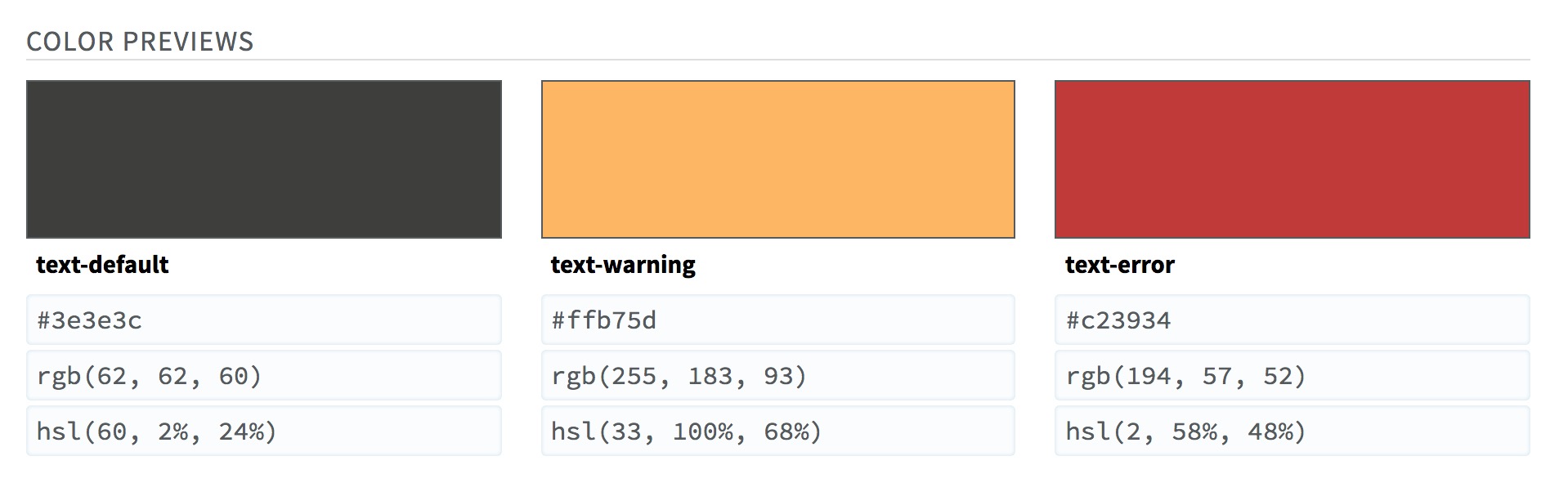
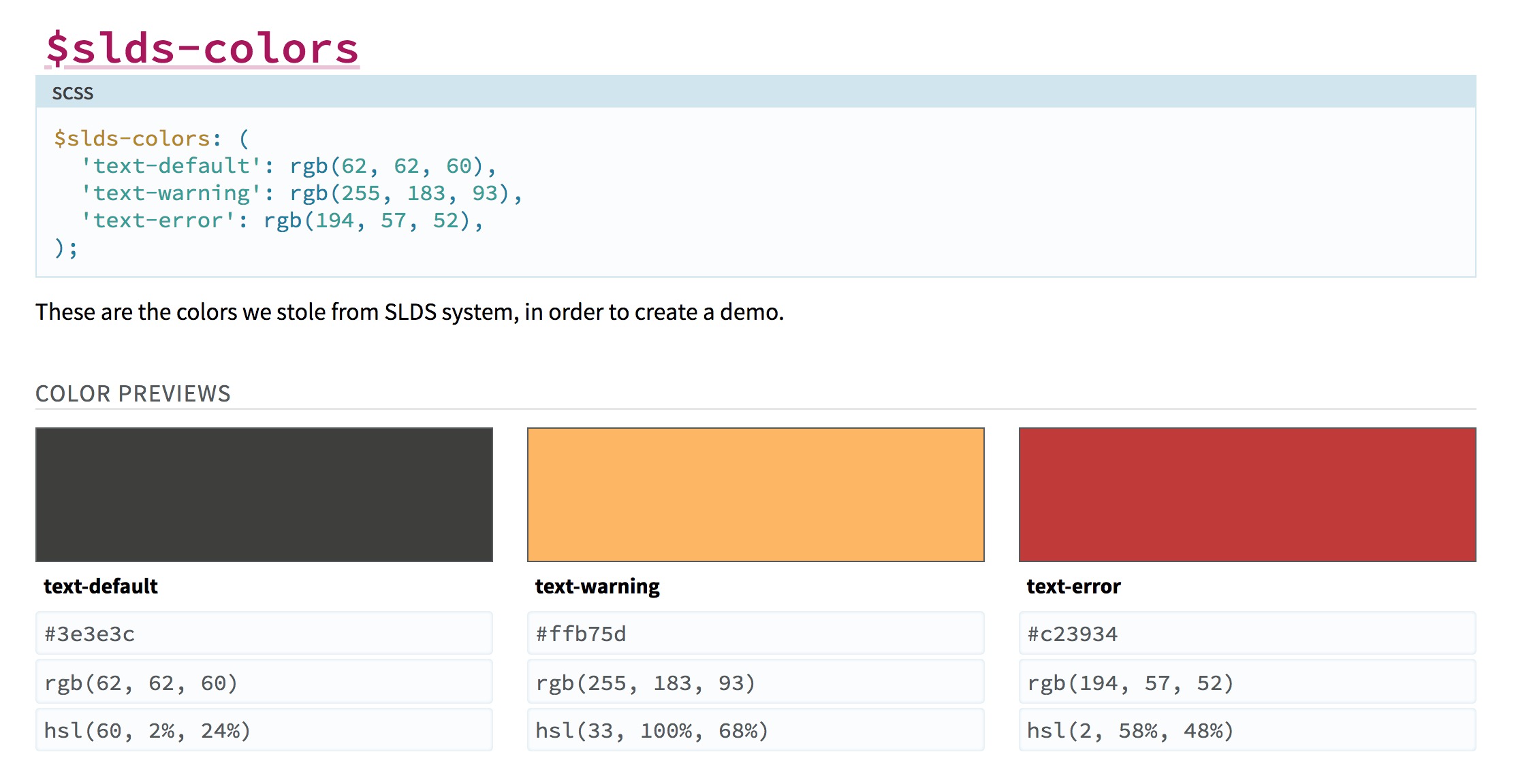
// SLDS Colors
// -----------
/// These are the colors we stole from SLDS system,
/// in order to create a demo.
/// @group color
/// @colors
$slds-colors: (
  'text-default': rgb(62, 62, 60),
  'text-warning': rgb(255, 183, 93),
  'text-error': rgb(194, 57, 52),
);
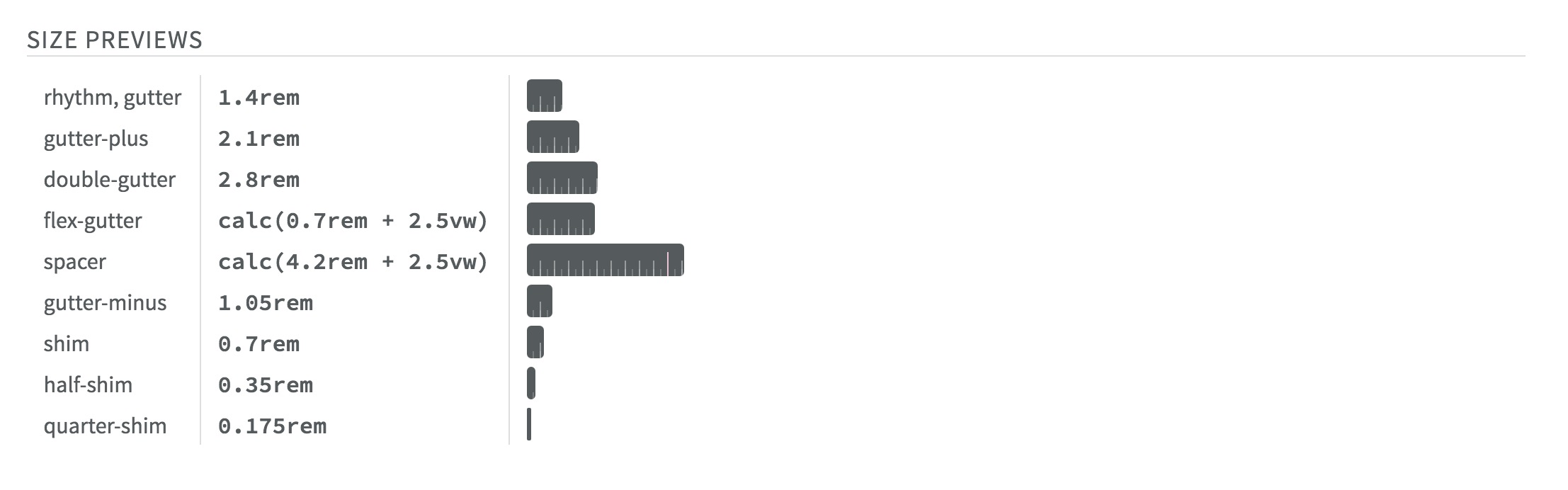
/// @colors
/// @sizes
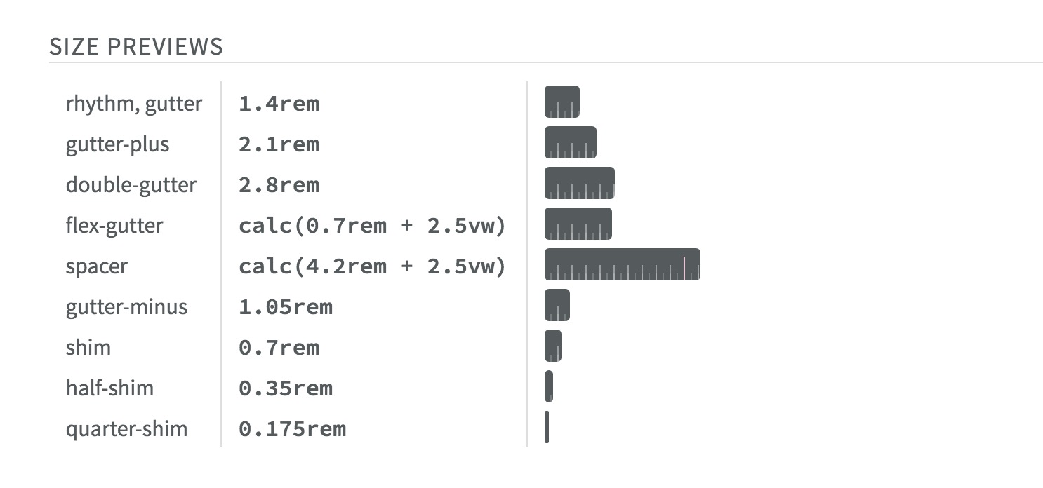
/// @sizes {ruler}
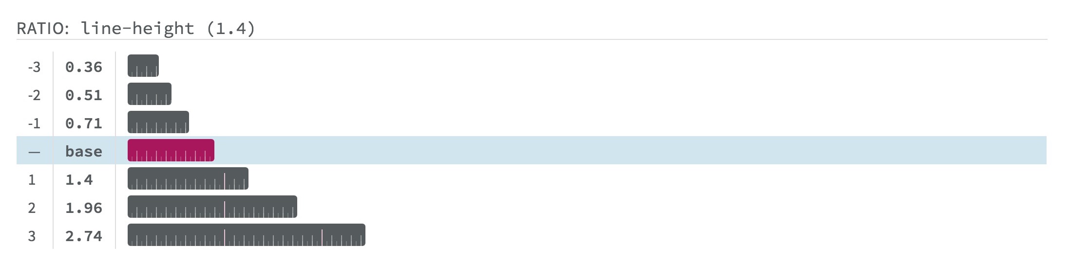
/// @ratios
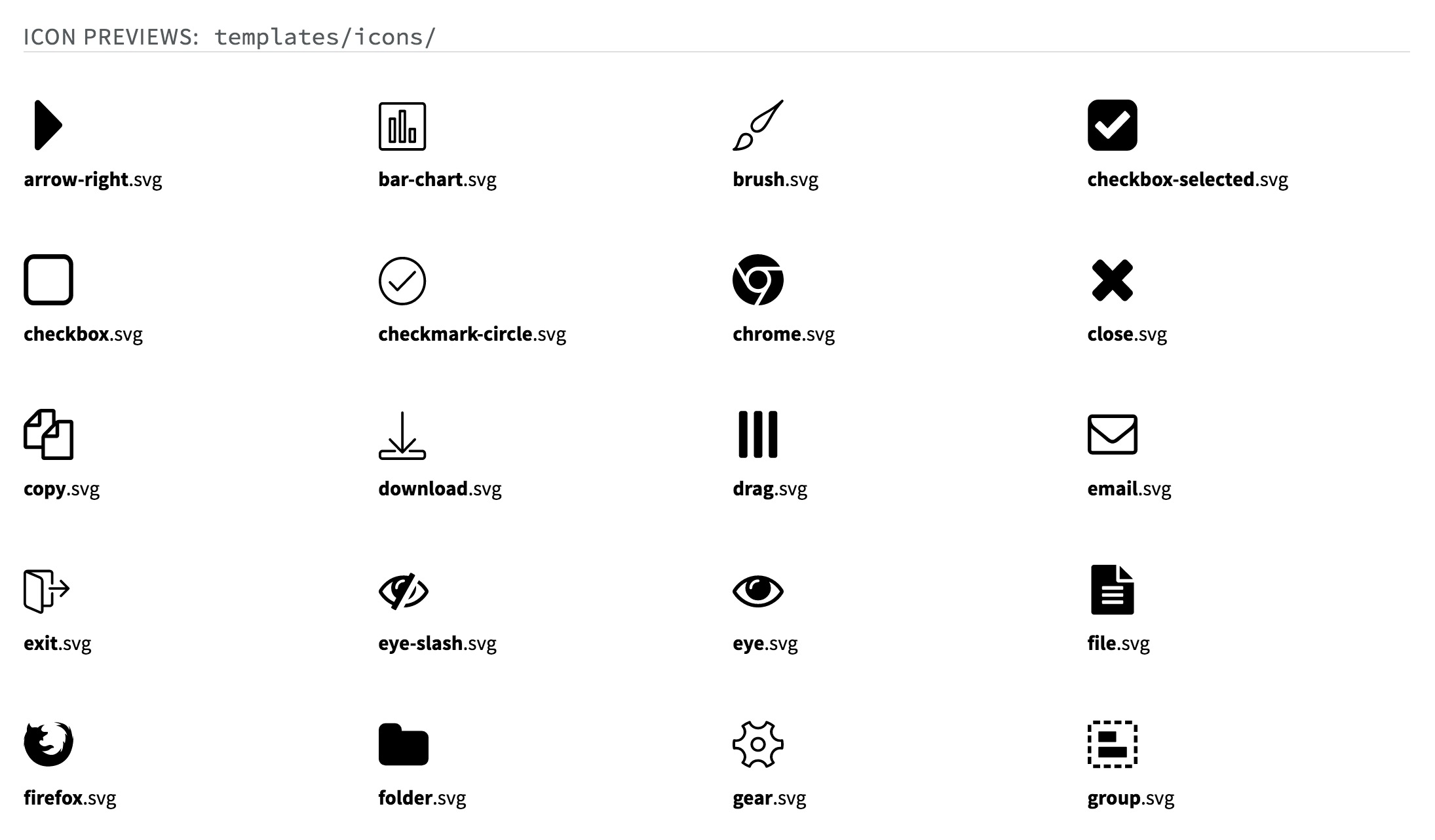
/// @icons templates/icons/
Herman Components
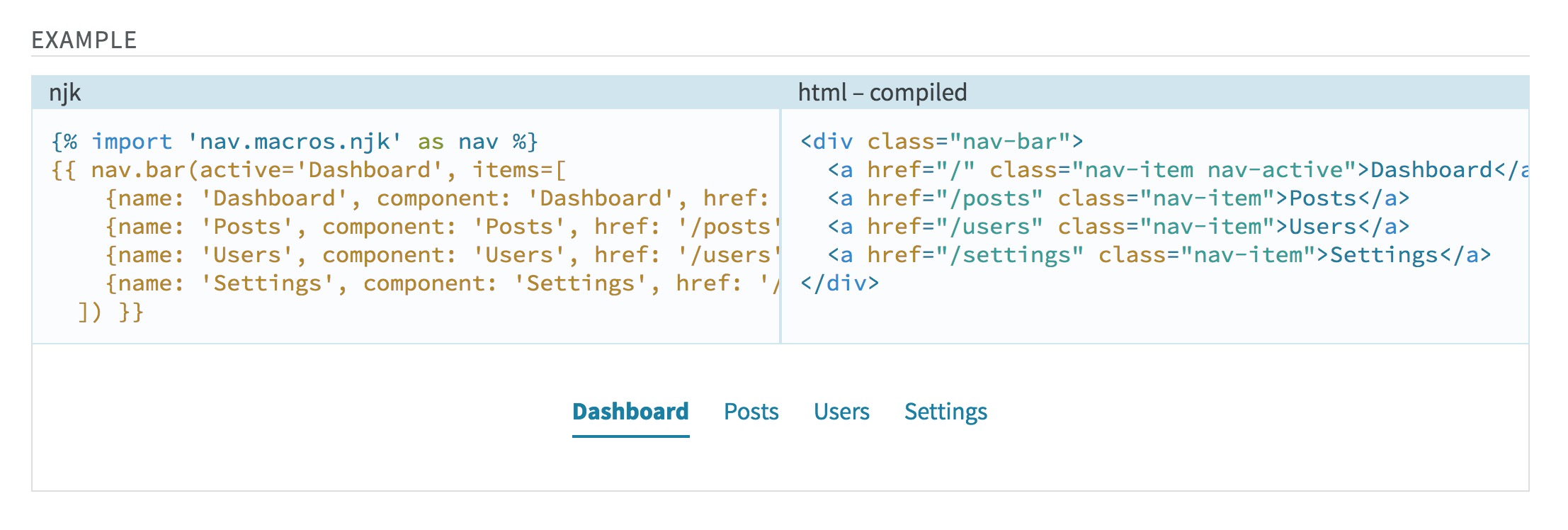
/// Navigation items, with inactive and active states.
/// @group nav
/// @example njk
///   {% import 'nav.macros.njk' as nav %}
///   {{ nav.bar(active="dashboard", items=[…]) }}
.nav-bar {
  /* … */
}
¯\_(ツ)_/¯
Sass-First Breaks Down…
Only Nunjucks For Now…
VueDS (with Theo)

VueDS Components
<docs>
  ```jsx
  <nav-bar active="Dashboard" :navItems="[…]"/>
  ```
</docs>
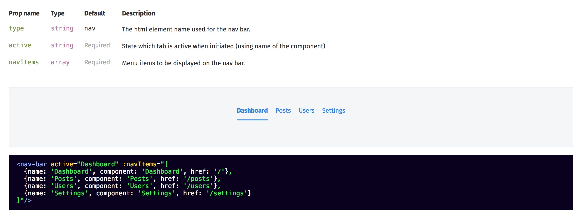
I Want Both :)
please…
Design System as Artifact
Code is a Single Source of Truth
- Why Design Systems?
- Pattern Audit
- Start Small
- Define The API
- Integrated Agile Process
Up-To-Date > Comprehensive
Start small, make it easy, and expand…
Meaningful & Structured Code
Readable by Humans & Machines
Inline Documentation
Helps the human factors…
Agile & Integrated Process
Everyone shares a single-source…